NMIX 4110
The New Media Production course has greatly expanded my knowledge and skills surrounding website development. Throughout the course, we focused on projects that built on skills that we learned from class like HTML, CSS, Bootstrap, WordPress, and Javascript. Using Visual Studio Code, I learned how to build websites by purchasing domains and a web hosting server by using cPanel. I initially learned how to create webpages from scratch solely using HTML and CSS. From there, I learned how to develop responsive websites by incorporating Bootstrap and design more intricate sites with WordPress (like this one right here.) Along the semester, we worked to complete hundreds of FreeCodeCamp assignments, which further progressed my range of skills previously listed. All in all, this course is extremely useful in preparing me for a diverse range of possibilities after graduation. Whether it be web development, media production, or even improving a future companies website, I feel that I am well-suited and prepared as these skills will set me apart from others because of this class and the New Media Certificate as a whole.
My Projects
Project One
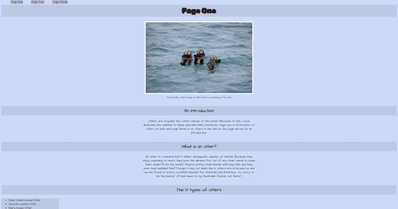
I really loved this project and felt that it was a fun way to introduce the course. Even though the website itself looks very bland, it was so cool building a website from purely HTML and CSS. I learned how to change font colors, background colors of specific elements, and font sizes to certain paragraph elements. I also learned how to incorporate multiple fonts, make unordered lists, center images and texts, and add borders to images and paragraphs. I really struggled with changing the background colors of certain elements. I wanted a separate background color to all of my unordered lists, but I didn’t want it to stretch across the screen. I wasn’t having any luck on finding out how to do this on FCC and after some searching around on the web, I saw some examples of it being used in html so I played around with it for a while until I was happy with it. I had to create a class for each unordered list because they were all different sizes and I only wanted the color to surround the text with minimal spacing surrounding it. In this project I really became comfortable with using classes. I didn’t quite get it all the way when I was learning it in FCC, but after this I was much more confident. I also loved creating the bulleted lists and adding the background colors to the h1 elements. Changing the font colors and adding a border to the images and text were simple ways that really helped spice up my pages.
Project Two

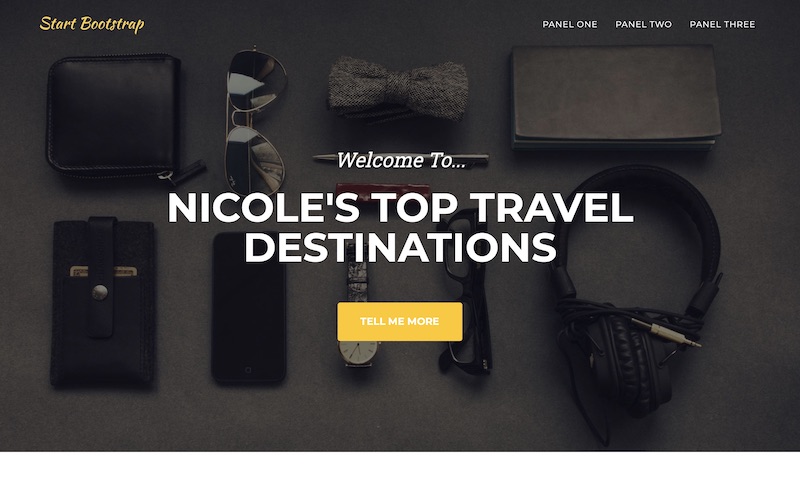
Panel one
For panel one, I really liked how my page turned out! This panel made me really get used to bootstrap and everything it has to offer. I learned how to add a navbar and a logo and experimented with the grid system. I think the little details that I added to the page, like the light blue borders around my text boxes and carousal of photos at the very top, made the page look elegant. Adding the breakpoints to my page was definitely the most challenging part. I wanted half of the page to be a photo and the other half to be text, so I would use col-sm-6, however, when I would minimize and expand the page, nothing would collapse in a seamless way and the words would just overlay the photos in an ugly way. It took hours of fiddling around with it until I finally got it to look decent. The other tedious part I faced was spacing out each paragraph and centering all of the text with the buttons, however, I managed to figure it out.
Panel Two
Panel two was certainly the easiest panel (and the ugliest) since we couldn’t change anything with css. However, I was able to get familiar with using templates to create a webpage. I changed the photos and added the images I used on panel one and added in the paragraphs as well. I changed all of the headers and titles and removed a TON of unnecessary content that was unneeded for my page. I didn’t necessarily have any issues with this panel, it was just super limiting without using css to make it unique.
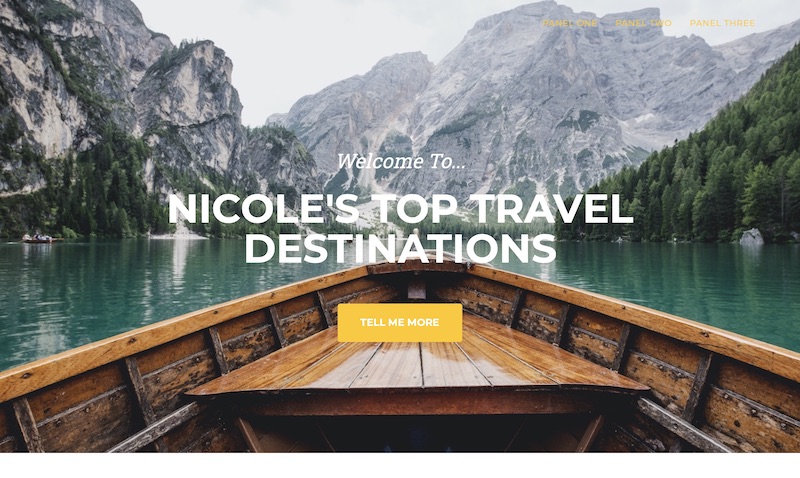
Panel Three
Panel 3 was certainly the hardest panel for me due to all the things I wanted to change on the webpage. I removed the logo at the top of the navbar and the random brands that were towards the bottom of the page. I changed all the colors, except for the yellow “tell me more” button because I felt that shade went well with my background photo. I ended up removing the borders around my images and made them squarer as opposed to the oval shape in the last panel. I centered the content in the “follow me” section and customized the text in the “contact me” section to make it pop. I am really proud of myself for figuring out how to change the background photos at the top and bottom of the page. I was really struggling with it at first because I couldn’t figure out why they weren’t like the other images and that you had to change them in css. Ideally, I wish my photos of the destinations were bigger and on the opposite side of its respected paragraphs, however, I could not figure out how to change this! I always ended up messing up the whole page or pulling something off the center. Although I know my project wasn’t the best, I am still very proud of it considering the NMI experts were unavailable and the personal circumstances I was going through during this project.
Project Three
News Website
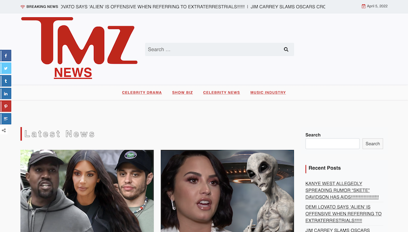
For my news website, I thought it wold be funny to recreate the TMZ website. I had a lot fo fun on this project creating a parody out of their ridiculous headlines. I used the NewsX Paper theme and the easy share plugin as well as the click to top plugin. For the fully fleshed out posts, I embedded videos and links to related stories as TMZ does in their articles. As for additional CSS, I incorporated a google font and changed a ton of the colored details on the homepage to match the red TMZ logo. I also changed the sizing and margin of the news header to compliment the logo better, and changed the colors of all the other headers and embedded links to accompany the red theme. I didn’t know how to do any of this before, but this project has really helped to make me more comfortable with using WordPress. One thing that I did struggle with, and would like to improve, are some of the areas in customizing the additional CSS. I was originally going for the black background that TMZ is known for, but I was having issues with getting the entire background to be black and it ended up looking like an eye sore so I resorted to using an all-white background.
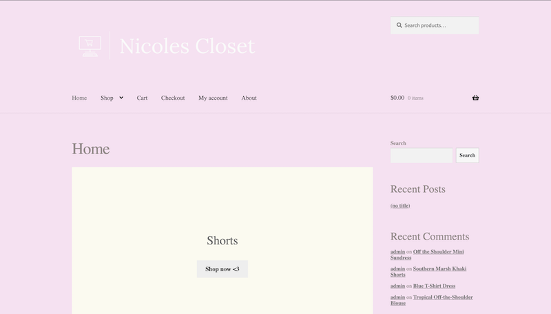
eCommerce Website
For my eCommerce website, I decided to make a remake of a personal Depop/Poshmark page of clothes of mine I was selling a few summers ago. I used the Storefront theme because I liked the clean and simple layout and incorporated my own photos of my clothes onto the webpage. As for the plugins, I used WooCommerce, a product size chart, customer reviews, and custom category images for the home page to easily navigate to my product categories. The only major trouble I ran into was not being able to see any customer reviews or comments after I would post them. For additional CSS, I changed the background colors as well as text colors of my webpage and experimented with different fonts. I created a logo for my site and used CSS to adjust it the way I wanted it. For my blog, I incorporated it into an About page for my “brand” and included a gif at the top along with a few paragraphs about the clothing. In the future, I would love to learn how to add more customization and detailing to the background of my website.
Final Project
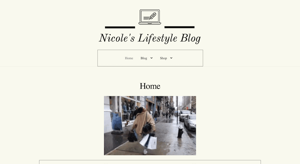
For my final project, I decided to do a speculative redesign of my e-commerce website and expand onto it, transforming it into a personal lifestyle blog. By building onto the website, I made the entire e-commerce site that I originally made for project three into just a small section of my whole blog. So instead of the entire site being centered around my re-sell store, it’s just one component.
Simplicity and minimalism was my main goal for this site. I personally hate webpages that are overcrowded with words and menus on all sides of the screen. I want the user experience to be as smooth as possible with no chance of someone getting lost or confused on my site. I completely revamped the homepage, getting rid of the category buttons to the shop site and changing the background color to a more subtle cream color. I also changed the text color across the whole site to black as I feel that both of these colors are classy and timeless. By using a plugin tool, I added an arrow plugin that scrolls to the top of the page as my blog section is pretty lengthy. I also changed the logo and icon of my page to make it better suit the blog style I am going for.

Using custom CSS, I removed all of the components on the right-hand side of the page, as it obviously isn’t needed for the blog portion, but I also felt that it is unnecessary for the shop itself, and simply unneeded. The parts that I removed include both of the search bars, cart, recent posts, recent comments, and archives. I also used custom CSS to center the logo at the top of my page, the main menu, and the titles on each individual page. One of my favorite additions to the site is the thin black border I applied to the h2 headers and main menu, using CSS. Adding padding to the menu to make it centered and even was a bit challenging and took a while for me, but I eventually got it to look how I wanted.
As for the bottom of the page, I added a widget that put little buttons and links to my social media sites such as Twitter, YouTube, Snapchat, Spotify, Gmail, and Instagram. Something that was a bit tricky for me was resizing all of the images to fit evenly on the page. At first, I tried adjust them by using the sliders, and it would look great until I updated the page and viewed it in an alternate browser. It did absolutely nothing. So after some fiddling around, I was able t adjust the dimensions of each image to make it a smaller size. The biggest challenge I faced was figuring out the elementor plugin. I wanted to incorporate this plugin as it seemed to contain a bunch of customizable features that are easy to use, however, it quickly became super complicated and I didn’t want to mess anything up on my website, so I will try to come back to it at a different time to learn more about it.
New Media Industries (NMI 4220)
The New Media Digital Brown Bag course applied a real-world approach to my education that I hold incredibly valuable. The class was discussion-based and offered insight into career paths within the new media industry by bringing in guest speakers to touch on their own experiences in the field. Although we only met once a week, the lessons I have learned from this course surpass many others I have taken. Each speaker we had the honor of listening to dove into techniques, issues, and technologies that are shaping this ever-changing field, with each one offering a different perception and experience.
Additionally, the course offered specialized classes to discuss aspects of adult life that are rarely acknowledged in a classroom setting; for instance, a lesson centered around credit, building credit, and how not to ruin your credit. In another lecture, we will be focusing on health care and insurance. These highly valuable lessons will follow me for the rest of my life; however, they will be vital as I enter the workforce. Likewise, Professor Ward implemented professional development assignments to further prepare us for what is to come after graduation. This includes tasks such as checking and understanding our credit scores, tuning into inspiring Ted Talks, and understanding our personalities on a deeper, professional level to connect it with an occupation. All of these skills will undoubtedly be added to my new media toolkit as I consider them essential after graduation. Furthermore, the tips that I learned from our multitude of guests, like how to negotiate pay with an employer, budget for taxes as a freelancer, and better understanding clients, are all aspects that I feel have left me better suited to accomplish my professional goals.